
Robinhood Crypto
OVERVIEW
As part of the launch of Robinhood's Crypto Wallet, I led the strategy and design direction for the waitlist experience in which the ProdX team built out an impactful brand moment for our crypto customers.
In addition to this work, I also helped with the refresh of our visual language for Robinhood Crypto that we rolled out via a new onboarding experience.
ROLE
Strategy
Art Direction
Product Design
Brand XP

Launching Crypto Wallet
Robinhood's Crypto Wallet was one of the most frequently requested features across the entire company – as such, it was an incredibly high priority project. The ProdX team was brought on only a couple of days prior to launch where we conducted a sprint, helping us to quickly determine a way in which to create an engaging brand experience for our waitlist.
The expectations from our leadership team were high, this was a big launch for us and they wanted something that was really impactful. They went as far as to reference a previous product launch for Fractional Shares. That project that had significant lead time and rather complex haptic interactions within the experience – a reference is shown below.
Nº1: 🚀 Robinhood's Fractional Shares rocket used as inspiration by our leadership team
Within those two days, I partnered with motion designer Daniel Belay to develop six bespoke ways in which we could build an interactive brand experience. Our goal was to create a memorable brand experience around our crypto wallet that was an exciting way for our customers to engage.
Nº2: ✨ Snippets of work from our six concepts for Robinhood's Crypto Wallet Waitlist
Concept Evolution
Within this sprint, we brainstormed, designed, and developed new ways in which to communicate the sending and receiving of different types of cryptocurrency.
I wanted us to explore what new coin variations could look like – was it a change in shape, color, or the actual design on the coins? In collaboration with Daniel Belay, we were able to build out rough compositions of what this could look like, as seen below.
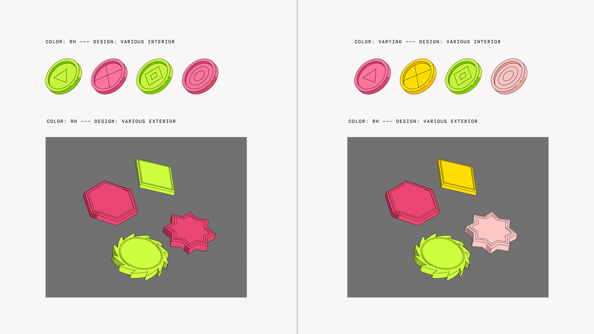
Nº3: 🪙 Coin concepts for visualizing different types of cryptocurrencies.
Direction & Alignment
Since we were working under such a tight time constraint, we realized that it wasn't the time nor the place to start going down the rabbithole of what different coin styles could look like.
We needed to hit our deadline and lock in on a concept that clearly communicated that wallets were coming and that users will soon have the ability to send and receive different types of cryptocurrencies on the Robinhood platform. That being said, we ended up going with a rather on-the-nose approach, using an actual wallet as a visual metaphor.
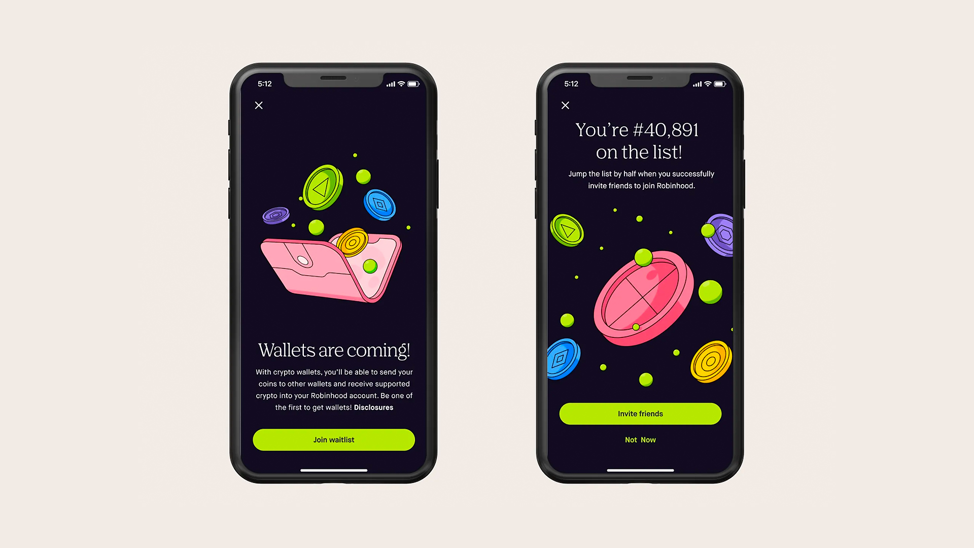
Nº4: 👛 Final concept for Robinhood's Crypto Wallets Waitlist.
Since signing up for the waitlist is a pretty quick experience, we didn't want to add any additional animations or interactions that slowed the user down. However, when considering the action in this moment, the emotional state of the user is elevated. They're excited about joining the waitlist, they have the opportunity to bump themselves up on the list and therefore I felt it was a good opportunity to lean into this emotional moment for the user.
With the help of the accelerometer and the engineering team we were able to build in a subtle tilt of the coins on the final screen where the user is given their spot in line and the opportunity to invite their friends. Adding a light touch of interactivity and what many call "delight" to the experience.
Nº5: 🔄 Animated prototype of the flow and the final screen that uses the accelerometer
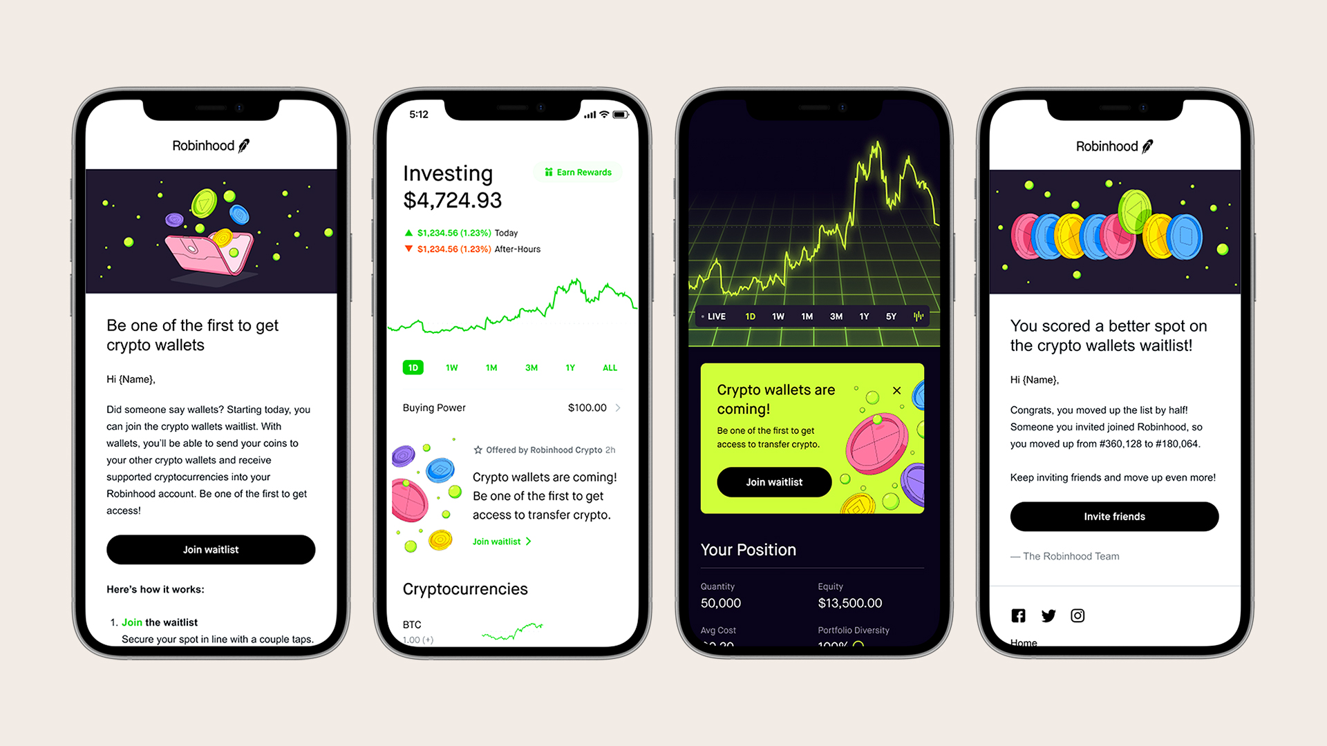
Nº6: 📱 Various product and marketing touchpoints where this concept showed up
Waitlist → Refresh
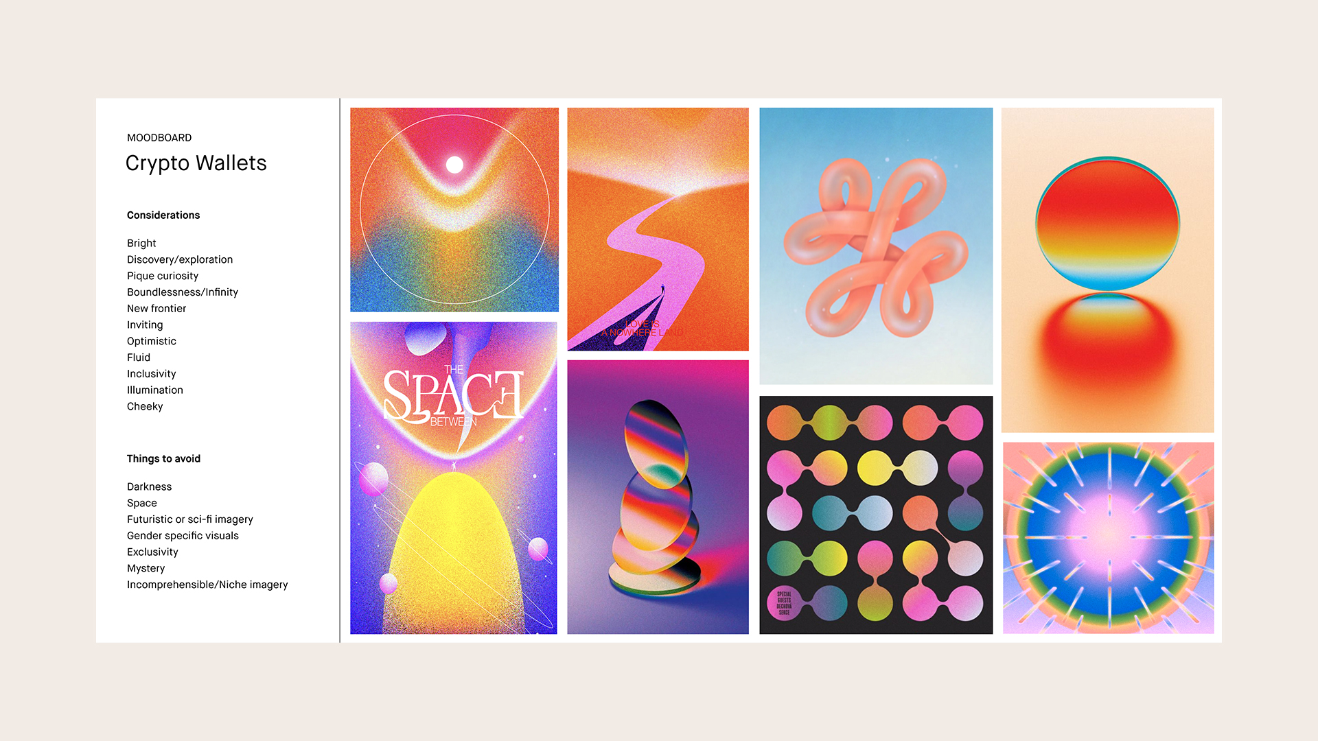
Leading up to the launch of the Robinhood's Crypto Wallet the ProdX team took the opportunity to audit and evaluate our existing Robinhood Crypto visual language. Since the inception of Robinhood Crypto, the theming for this area of the product took a rather dark and futuristic approach – which we as a team felt like it needed to be revisited.
With so much excitement and momentum around the crypto and NFT space, we wanted to bring that same level of enthusiasm to our Robinhood Crypto identity. Our goal was to push the existing visual language into a space that would allow us to innovate on the system as we continued to work on new crypto features.


Nº7: 🪟 The existing Robinhood Crypto identity and the new visual style we developed
The refresh of the visual language was a herculean team effort, we had a team of three designers iterating on potential directions in which to head. In close collaboration with 2-3 motion designers, it was very much an all-hands-on-deck situation for the next few weeks. Shown below is a rough depiction of our explorations and progress over the course of a few weeks.
Nº8: 🎨 A collection of color studies that were conducted
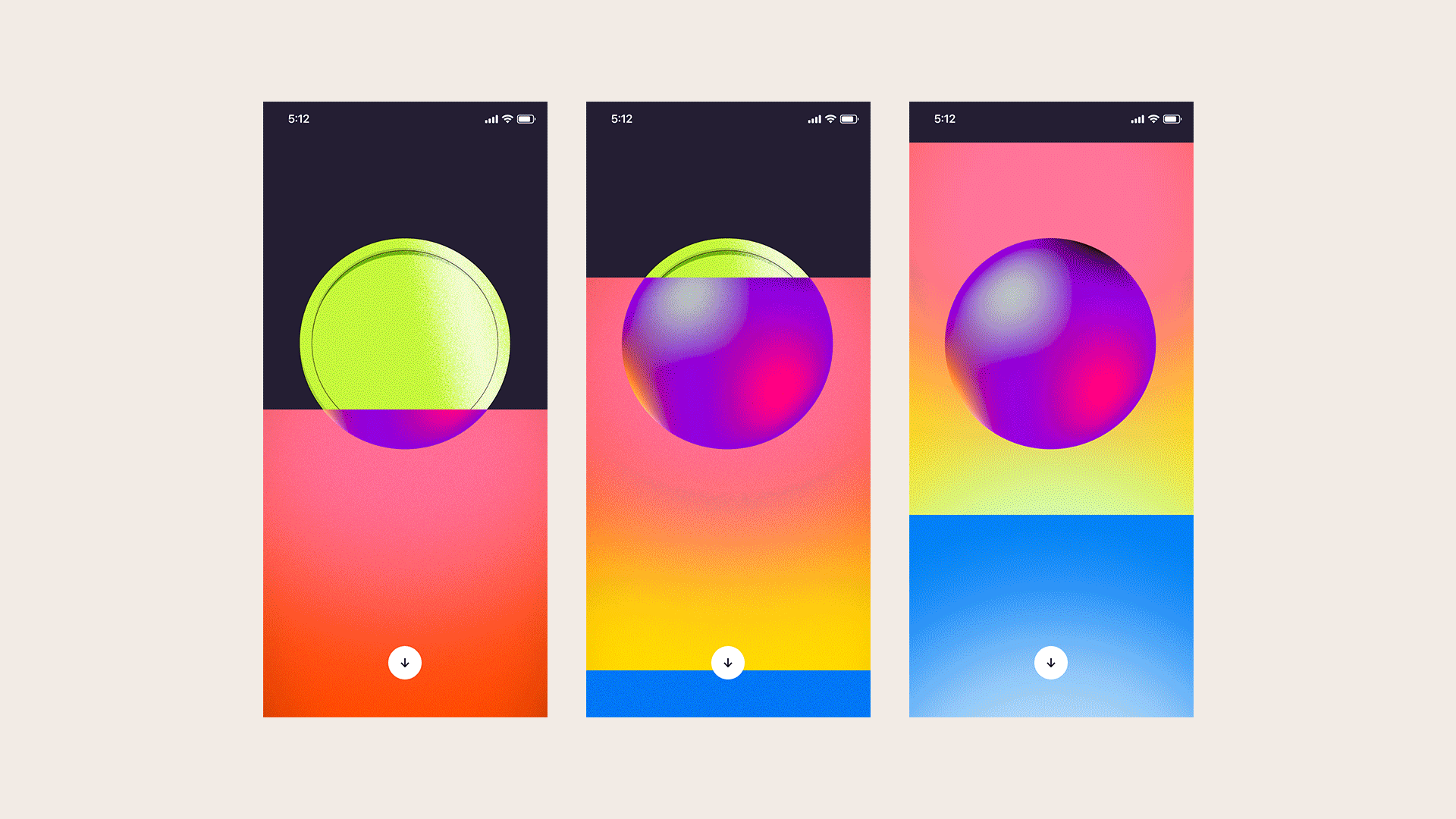
Nº8: ⚖️ A sneak peek into the many different design directions and art styles we explored
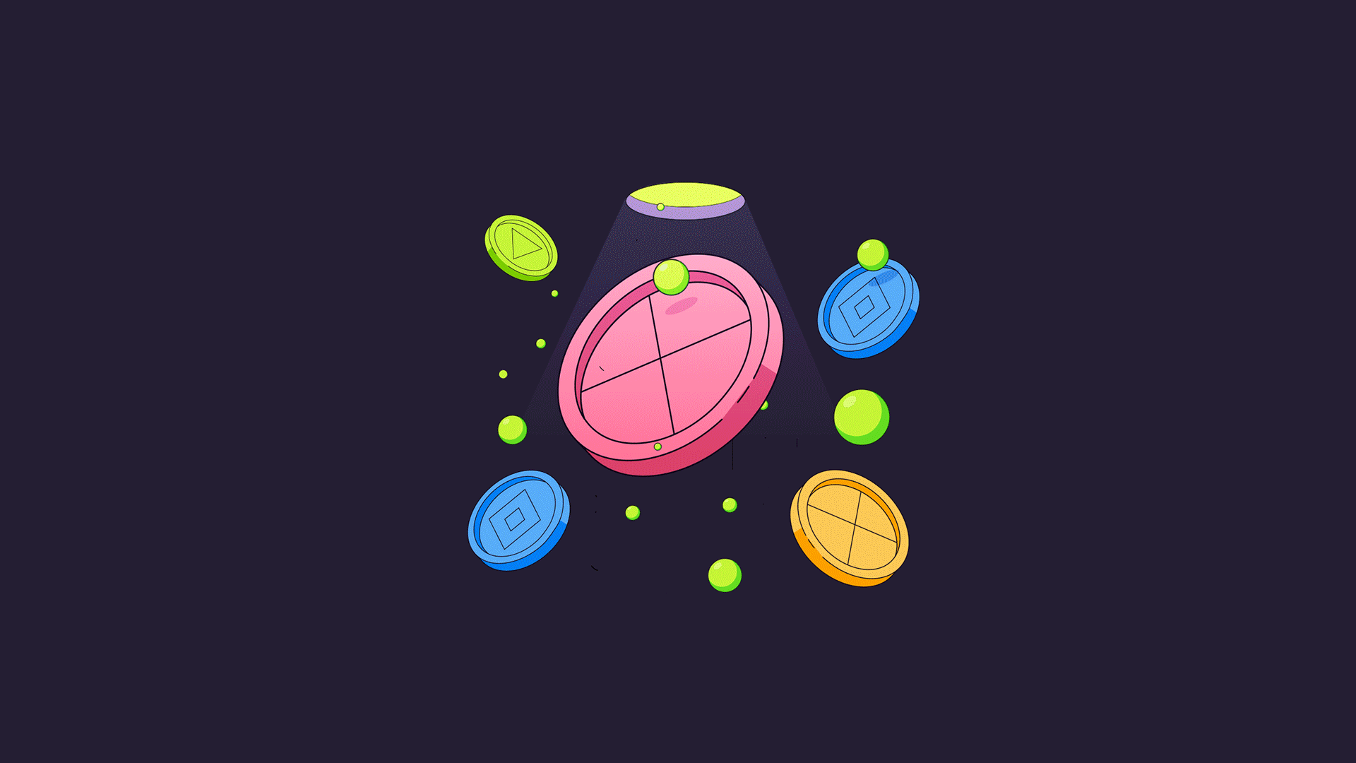
This design direction and overall art style intentionally varied from screen to screen as the focal point was the coin and the concept was centered around the journey of the coin and the many places it will go.
With the idea that the coins would transform and travel as our users now have the flexibility to send and receive crypto all in on place here on Robinhood – your crypto, your choice.
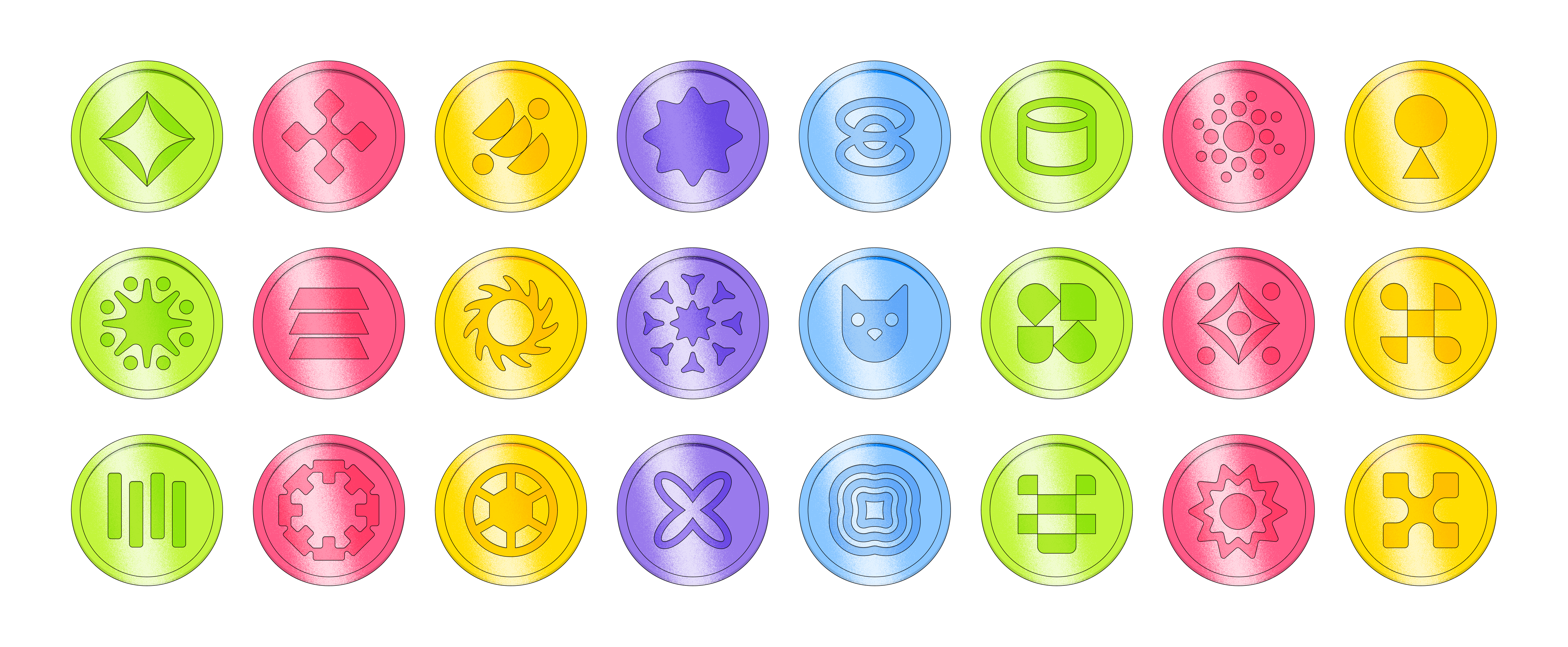
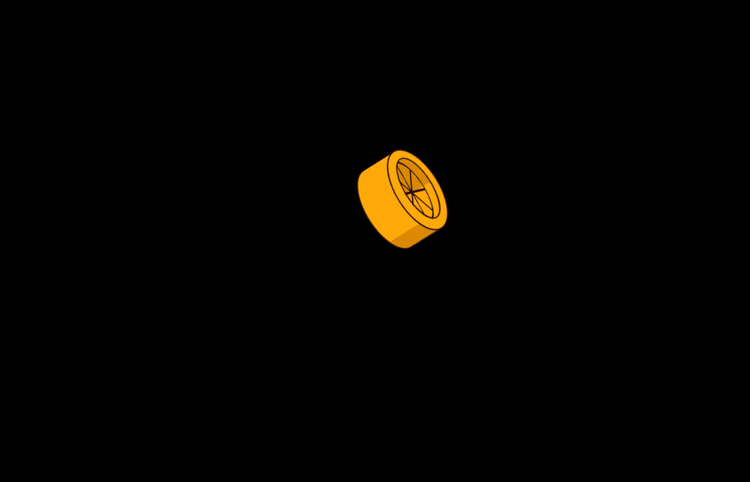
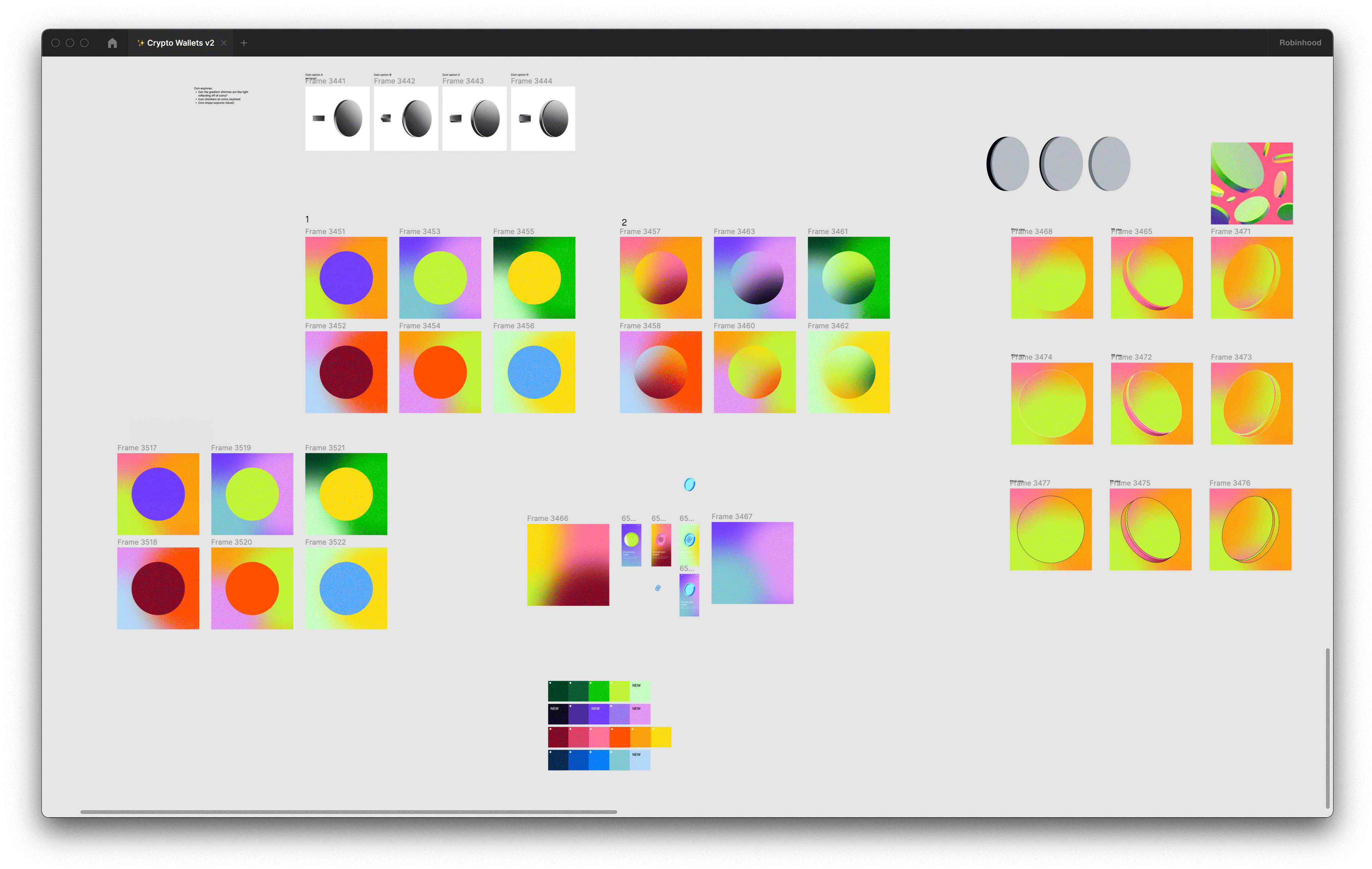
Nº9: 🌀 A collection of coin designs I made for the team to pick from for our renders
Direction Refinement
After many weeks of exploration, cross-functional discussion, and leadership feedback we eventually landed on a 3D illustration style that felt new to the Robinhood brand, yet, it wasn't a far departure from the overall visual language that we've been building over the past couple years.
We were able to then move into the motion design aspects of the project where Mackenzie Pringle, Daniel Belay, and Ryan Lewis began to flush out how these screens would move and transition. With the help of the engineering team and a little bit of back and forth on a Lottie vs. MP4 approach we were able to finally ship something the team was proud of and also more importantly a visual language we could continue to scale.
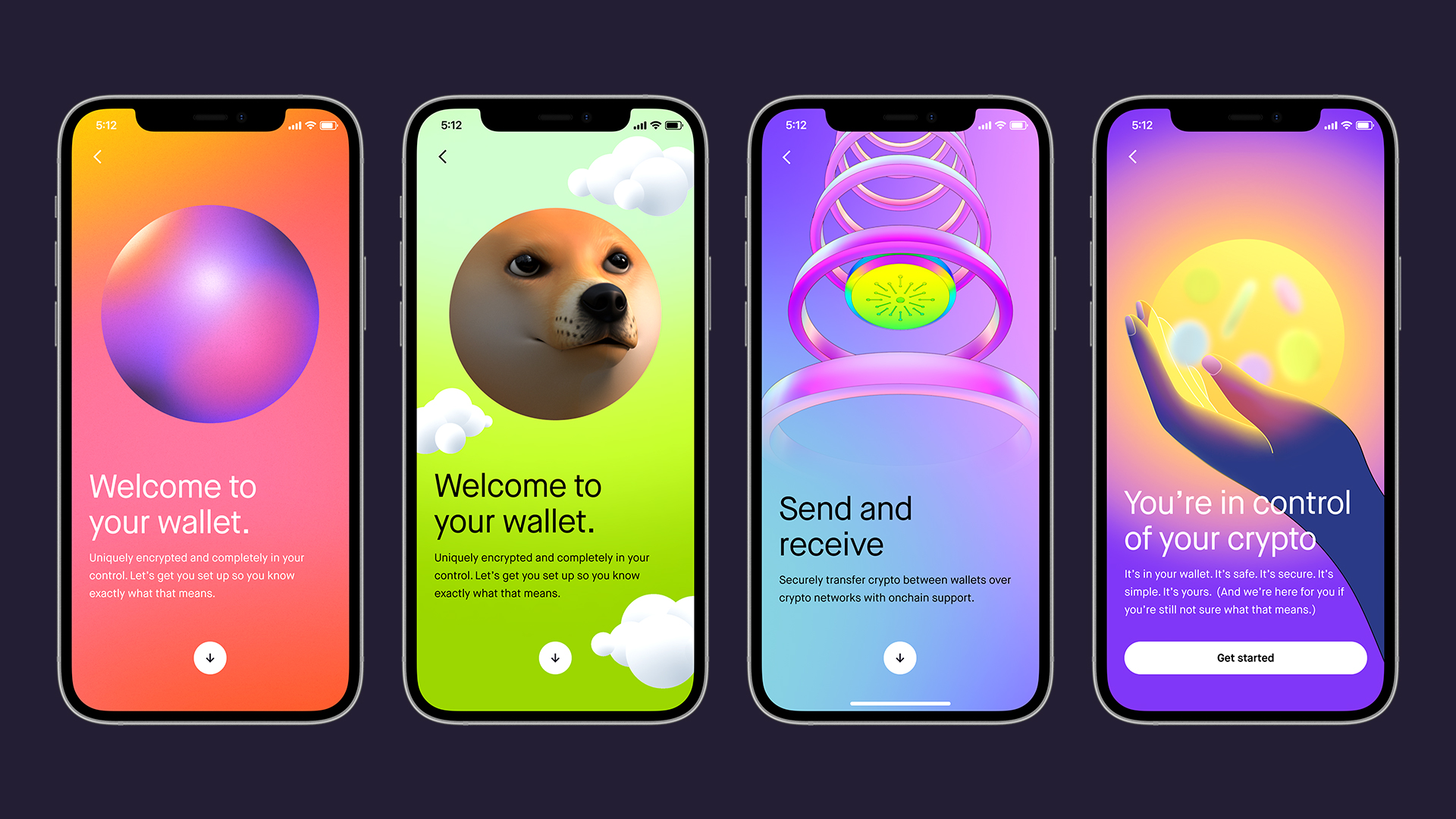
Nº10: 💌 A few notable screens from the final onboarding experience for Robinhood Crypto
Shown below is a short promotional reel that Ryan Lewis and Daniel Belay worked on for the Bitcoin 2022 Conference in Miami, Florida. It showcases the refreshed visual identity of Robinhood Crypto and was created to get attendees excited about the future of Robinhood Crypto.
Nº11: 🔮 Promotional reel for the refresh of Robinhood Crypto shown at the Bitcoin 2022 Conference
Credits:
Visual Designer 👉 Mackenzie Pringle
Visual Designer 👉 Jorge Andres Sierra
Product Designer 👉 Akhila Bhoopalam
Motion Designer 👉 Daniel Belay
Motion Designer 👉 Ryan Lewis
Illustrator 👉 Haelee You
Creative Lead 👉 Daniel Haire
Design Manager 👉 Kim Ryu